Mapping Hurricanes Data III
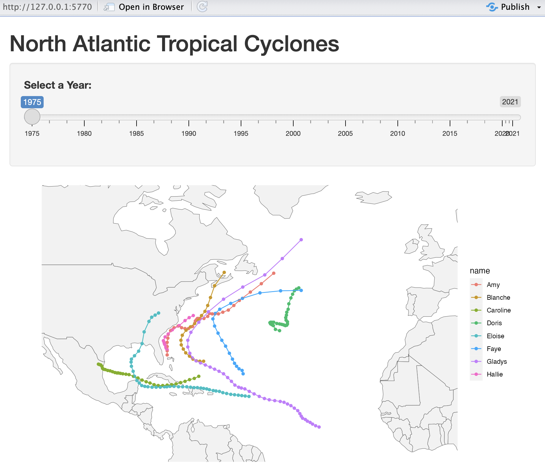
Using the storms data, I want to show you a variety of examples for displaying maps, for doing more data manipulation, and for obtaining more data visualizations.
The content in these slides depend on the following packages1:
To visualize the trajectories of storms, we’ve discussed one simple approach based on:
Use map data from "rnaturalearth"
Specifically, import map data as objects of class "sf"
Make maps with:
# filtered storms
storms75 = filter(storms, year == 1975)
# map data (as "sf" object)
map_world = ne_countries(returnclass = "sf")
# map with storms trajectories
ggplot(data = map_world) +
geom_sf(color = "gray60") +
coord_sf(xlim = c(-110, 0),
ylim = c(10, 60)) +
geom_point(data = storms75,
aes(x = long, y = lat, color = name)) +
theme_minimal() +
theme(legend.position = "none") +
labs(title = "North Atlantic Storms, 1975")# A tibble: 655 × 3
year name n
<dbl> <chr> <int>
1 1975 Amy 31
2 1975 Blanche 20
3 1975 Caroline 33
4 1975 Doris 29
5 1975 Eloise 46
6 1975 Faye 19
7 1975 Gladys 46
8 1975 Hallie 14
9 1976 Belle 18
10 1976 Candice 11
# ℹ 645 more rows
# add `wind_max` column
max_wind_storms = storms |>
group_by(year, name) |>
summarise(
wind_max = max(wind),
.groups = "drop")
slice_head(max_wind_storms, n = 10)# A tibble: 10 × 3
year name wind_max
<dbl> <chr> <int>
1 1975 Amy 60
2 1975 Blanche 75
3 1975 Caroline 100
4 1975 Doris 95
5 1975 Eloise 110
6 1975 Faye 90
7 1975 Gladys 120
8 1975 Hallie 45
9 1976 Belle 105
10 1976 Candice 80
case_when()# A tibble: 10 × 4
year name wind_max wind_scale
<dbl> <chr> <int> <int>
1 1975 Amy 60 0
2 1975 Blanche 75 1
3 1975 Caroline 100 3
4 1975 Doris 95 2
5 1975 Eloise 110 3
6 1975 Faye 90 2
7 1975 Gladys 120 4
8 1975 Hallie 45 0
9 1976 Belle 105 3
10 1976 Candice 80 1
storms_status = storms_status |>
mutate(wind_scale = ordered(wind_scale))
storms_status |>
count(year, wind_scale) |>
ggplot() +
geom_col(aes(x = year, y = n, fill = wind_scale)) +
facet_wrap(~ wind_scale, scales = "free_y") +
labs(title = "Number of Storms Over Time, and Status",
y = "Count") +
theme_minimal() +
theme(panel.grid.minor = element_blank(),
legend.position = "none")"gganimate" extends the grammar of graphics as implemented by "ggplot2" to include the description of animation.
It provides a range of new grammar classes that can be added to the plot object in order to customize how it should change with time.
I will show you just one example.
As usual, start your graphic with ggplot()
Add layers with graphical primitives, i.e. geoms
Optionally, add formatting specification(s)
Add animation specification(s)
storms2020 = filter(storms, year == 2020)
map_world = ne_countries(returnclass = "sf")
map_storms2020 = ggplot(data = map_world) +
geom_sf() +
geom_point(data = storms2020,
aes(x = long, y = lat, color = name, size = wind),
alpha = 0.9) +
coord_sf(xlim = c(-110, 0), ylim = c(5, 60)) +
theme_minimal() +
theme(legend.position = "none")
map_storms2020datetime columnWe create a date column by joining year, month, and day
We also create a time column by joining hour with "00:00"
And then we create a datetime column using the ymd_hms() function from package "lubridate"
anim2020 = ggplot(data = map_world) +
geom_sf() +
geom_point(data = storms2020,
aes(x = long, y = lat, color = name, size = wind),
alpha = 0.9) +
coord_sf(xlim = c(-110, 0), ylim = c(5, 60)) +
theme_minimal() +
theme(legend.position = "none") +
labs(title = 'Date: {frame_time}', x = '', y = '') +
transition_time(datetime) +
shadow_wake(wake_length = 0.7) +
ease_aes('linear')"plotly"ggplotly()As you know, you can take a ggplot object and feed it to ggplotly()
ggplotly() converts the graphic to a plotly object
Interestingly, you can also make animated views with "plotly"
"plotly"In the ggplot command, include a frame aesthetic to indicate the variable that will be used to produce the animation frames. For example: frame=year
storms2020 = filter(storms, year %in% 2000:2020)
map_world = ne_countries(returnclass = "sf")
# messy ggplot
ggmess = ggplot(data = map_world) +
geom_sf(color = "gray60") +
coord_sf(xlim = c(-110, 0), ylim = c(10, 60)) +
geom_path(data = storms2020,
aes(x = long, y = lat, group = name, frame = year),
color = "#1726FF", alpha = 0.8) +
theme_minimal() +
theme(legend.position = "none")Then, pass the ggplot object to ggplotly()
https://github.com/data133/shiny/blob/main/mapping-storms1-basic/app.R